Silence is so Accurate
Rothko in Florence

I’VE been thinking a lot about silence lately, locked, as I was, inside my own head by an ear infection so bad it left me unable to hear the boiling of a kettle or the closing of a door. Partial deafness is not new to me. I’ve struggled to hear out of my left ear for a long time, and occasionally I struggle with my right. But this silence was more profound than anything I had previously experienced. With my husband away, I padded around our muffled house on noiseless feet, like a monk or the Holy Ghost.
The stripping away of sound is disorientating, but it can also be clarifying. Forced into the recesses of your mind, thoughts crystallise, perceptions distil. I have also, as my hearing declined, found myself more susceptible to colour and light, to the point where the yellow of a buttercup or the red of a rowan berry, or a ray of sun chameleoning the grass from sage to emerald can induce an exquisite pleasure bordering on pain.
“Silence is so accurate,” Mark Rothko said. His artistic career was defined by a visual decluttering from his early figurative paintings to the great slabs and streaks of colour which made him famous, and by an aural decluttering from giving his work evocative names, such as Tiresias, to keeping them “untitled”, so the observer had no choice but to surrender to his or her unmediated emotional response.
Despite early flirtations with the movement, Rothko was, in the end, an anti-surrealist. In The Treachery of Images (“Ceci n’est pas une pipe”) Magritte stressed the distance between the painting and the object it depicted. Rothko insisted his canvases were not representations of an experience but the experience itself, with those who looked at them mainlining the joy, anguish, grief or despair he felt while he was in the act of creation. Any explanation or deconstruction would be white noise: interference on the line between the artist and his audience.
There can be no people who better understand the power of silence to evoke transcendence than those who join contemplative religious orders, and no individual who better understood the power of the visual image as a prompt for contemplation than Fra Angelico, 15th Century resident friar and “decorator of sacred spaces” at the Convent of San Marco in Florence.
When Rothko first visited San Marco in 1950, and saw the frescoes Fra Angelico had painted in a dozen or so of the friars’ cells, he was so moved he stayed until the museum closed, then returned the next day. A Jewish Latvian émigré, he had renounced institutional religion, yet his art was one long pursuit of the sublime. Here, in the hushed hermitages of a Dominican complex, he understood for the first time how light and colour could combine to produce a spiritual intensity beyond language.
It was a piece of genius on the behalf of his son, Christopher, and Elena Geuna, joint curators of the wonderful Rothko in Florence exhibition, to choose San Marco as one of the three venues in which the painter’s work would be shown. And it was a piece of luck that I booked to go there first because seeing the two men’s work in parallel makes sense of all he aspired to achieve.
I was also weirdly grateful my world was still on mute; it brought me closer to the friars and their lives of quiet detachment. Their cells, set out in a row on either side of a long corridor, were whitewashed and bare, the only furniture a wooden bed, long since removed. But on each back wall was a tiny arched window with shutters, like a window on an advent calendar, through which the sun streamed, casting a perfect mirror arch on the floor and lighting up the frescoes.
Deprived of rival stimulants these frescoes would have been the chalice into which the friars poured their devotion. Connoisseurs of every brush stroke, every head tilt, every gesture, the particular religious tableau they were gifted must have exercised their imaginations and haunted their dreams.
In the five cells which also contain Rothko works, the shutters were closed. But before he was a painter Fra Angelico worked on illuminated manuscripts, and the frescoes seem possessed of their own internal shine. The paints he used contained silica, quartz or mica, so bits of it glitter: not only, as you might expect, the angels’ multi-coloured wings, but the blood, which spurts from Christ’s wounds and runs in rivulets down the bases of the crosses, so you feel that if you reached out and touched it, it would still be wet.
The Rothko partner paintings are well chosen, not merely for their complementary palettes and tones, but for the responses they trigger. One – Gethsemane – paired with Fra Angelico’s Transfiguration predates Rothko’s first visit to San Marco which suggests his instant attraction lay in Fra Angelico’s reaping of a harvest Rothko had only just sown.
In Gethsemane, biomorphic shapes and muted greys and reds suggest Christ’s suffering and betrayal. Fra Angelico places him within a bright mandorla to trumpet his glory. What connects them is the way they lay siege to our emotions rather than our intellect. These paintings do not exist to teach us moral lessons; they tap in to all that makes us human.
In cell 4, the fuzzy brown, framed top and bottom by heavy blacks, of Rothko’s Untitled (1958) keens the same lamentation as Fra Angelico’s Crucifixion with the Virgin, Saint John the Evangelist, and Saints Dominic and Jerome. But the paintings that left the deepest impression – perhaps because they fill cell 3 with hope – were Fra Angelico’s Annunciation and Rothko’s Untitled (1954).

This depiction of the Angel Gabriel with the Virgin Mary is much smaller and more intimate than Fra Angelico’s more famous Annunciation which hangs at the entrance to the dormitory. Here the architecture within the painting echoes the architecture that surrounds it so the figures appear to be standing in a cell within a cell. What touches most deeply is Mary’s vulnerability as she clasps her arms around herself, the son of God no more than a pinprick inside her as-yet unswollen womb, and the glow that radiates towards her as the good news is delivered.
Rothko’s painting is mostly reds and pinks, with a faltering, half-formed smear of yellow across the middle: an incipient flame; the first flicker of salvation. Vasari tells us tears poured down Fra Angelico’s cheeks as he painted. Rothko wanted his work to make others weep. I didn’t weep in San Marco; but I almost prayed.
*******
My parents raised me Catholic, and for a long time my Catholicism was important to me. Once a year, my schoolfriends and I would go on religious retreat to a big country house and, along with the larks and the lusting, there would be periods of silence and meditation. I find it poignant, even now, to remember how earnestly, at a time of flux, we applied ourselves to the search for meaning and the infinite. As adolescents, our emotions were raw, see-saw. We had not learned to shut them down. Every day, during prayers in the oratory, or at workshops where we were encouraged (quite unwisely) to unlock the secret parts of us, someone would cry.
In 2018, I lost my faith, along with some other things. I do not want it back, but there are things I miss: the ritual of mass, the rhythm and structure of the liturgical calendar, the time out for reflection services afforded. More than that, I miss the seeking and the surrender to something beyond my ken or control. I think this want – this spiritual starvation – is so widespread now as to be endemic. That’s why nature and nature writing are so popular. It’s why stone circles have become tourist attractions. It’s why people love Rothko.
**************
Not everyone loves Rothko. Like all abstract artists who make it big, there is a “my five-year-old could paint that” flippancy around his work. On social media platforms, people post photographs of, say, a streaky slice of cheese on toast with the caption: “Cooked myself a masterpiece.”
Some of it is tongue-in-cheek homage. Current Rothko is a website which matches the weather forecast in your area to one of his paintings. I tried it out before I left home. Outside my window, the day was dank, the sky overcast. The website gave me “Blue and Grey, 1962”, and the caption: “A heavy quiet outside – the grey field carries the same quiet hour.” It was uncanny; I laughed.
Standing in front of the giant canvases in the Palazzo Strozzi – the principal exhibition venue – all I could think was how reductive those jokes were. Viewed in person, Rothko’s paintings are so much more than one block of colour set above or below or beside another. They are numinous tempests, violent force fields, mercurial landscapes you can feast on, roll with, drown in. The reds are not “red” but a myriad shades of scarlet, carmine, cinnabar, crimson, which ebb and flow and pulse and throb and fade. The blues are peacock, teal, navy, midnight, each stimulating a different part of the brain. Here, the paint is thick as porridge; there, no more than a wash. The edges of each field are nebulous, frayed, feathered, the colours often bleeding into one another. Look closely and you may see faint smudges of light in a greyish haar.
I found it hard, at first, to avoid pareidolia. Our eyes, much more than our ears, are conditioned to seek patterns in chaos and to see faces emerging from the shadows. The monumental Untitled (1952–53) is on loan from the Guggenheim in Bilbao, and, at nearly 10 ft x 14.7 ft, takes up most of a wall. In its red, I saw a bloody battle, or a field of poppies, and in the strip of the dirty pink across the yellow, a wound from which a plaster had been freshly ripped. In the reds on the paintings I knew had been inspired by a trip to Pompeii, I perceived not only echoes of the Villa of the Mysteries, but the lava flowing inexorably down Vesuvius, wiping out everything in its tracks. An electric blue line across black was a flatlined electrocardiograph.

Having stood for a while at a distance of 18 inches, as per Rothko’s instructions, I did eventually stop thinking and abandon myself to the sensory undertow, as I would to a piece of music. The crescendoing and diminuendoing of colours quickened my breath; my moods shifted with their major falls and minor lifts. Some paintings roused and exhilarated, others soothed or saddened or suffocated. A handful seemed to walk the observer to the edge of an abyss. All reached out towards that point where ecstasy meets despair.
In the same way as I know to resist pareidolia, I understand Rothko chafed against efforts to chart his state of mind through his works; but the paintings do become more violent, and then more minimalist, as the exhibition and his life progress.
Rothko suffered an aortic aneurysm in 1968, and killed himself in 1970 by a drugs overdose and cutting his inner arms with a razor blade. Every article you read about his suicide remarks on the six foot by eight foot canvas of blood that pooled beside his body. It’s impossible not to think about this as you gaze on his reds and blacks. By the time he died, though, his colour palette was much more sombre and subdued.
The canvases for the Rothko chapel in Houston, sketches and studies for which are included in the exhibition, contain deep purples and maroons as well as black and grey. Still, they are suggestive of effacement – an artist turning ever inward until he disappears into his own artistic vision.
*************
“Masterpieces for the end of the world,” is how art critic Jonathan Jones describes Rothko’s Seagram murals. Just as Fra Angelico painted a Last Supper for the San Marco refectory, these paintings were supposed to grace the Four Seasons restaurant of the Mies van der Rohe-designed Seagram Building in New York. Considering the Manhattan diners less receptive to spiritual catharsis than Dominican friars, he backed out of the commission and gifted them to the Tate Modern where they remain today.
Two studies for the series, though, are hanging in the vestibule of Michelangelo’s Laurentian Library as part of the exhibition. I couldn’t get a ticket for the same day, so I returned to Florence later that week. I was walking across the square towards it when my hearing suddenly returned, the city noises breenging stridently in.
The vestibule is Michelangelo’s weirdest creation: a building turned inside out. Its beautiful, Escher-esque grey sandstone staircase – a set of fluid elliptical steps flanked by on either side by rigid rectangular ones – looks as though it should be bearing VIPs up to the entrance of a grand palazzo, while the walls are constructed of the columns and corbels and blind windows one would expect to find on a facade.
When Rothko first saw it he loved its claustrophobia, describing it as just the feeling he was after. “He makes the viewers feel as though they are trapped in a room where all the doors and windows are bricked up,” he told a friend, “so all they can do is butt their heads forever against the wall.”
Rothko successfully absorbed that feeling into the Seagram murals; I could sense it even in the studies. On the left, a sash of sun from a paned top window mitigated a dark red rectangular frame on a lighter red background. On the right, a molten red liquid, which simmered behind thick, black rectangular frames, held me at its mercy.
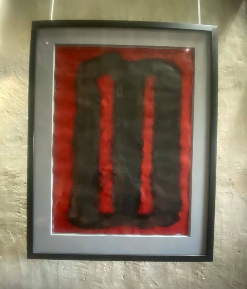
Wrenching myself from the room’s confinement, I headed out into the upper storey of an enclosed courtyard which, by contrast, felt open and exposed. I remembered, then, that Dominican friars have never taken vows of silence. They combine their periods of contemplation with a life out in the world: preaching, teaching, providing pastoral support. They have their own chant, O Lumen Ecclesiae (Oh Light of the Church) which they sing at Compline. Down below, sparrows hopped across the branches of the lush green trees, and played hide and seek among the cloisters. In my newly open ears, their chirping resounded like an orchestral symphony.
I think like everyone else, I will have to read this again, but even on a first reading, it is both beautifully written and very moving
Absolutely lovely.